
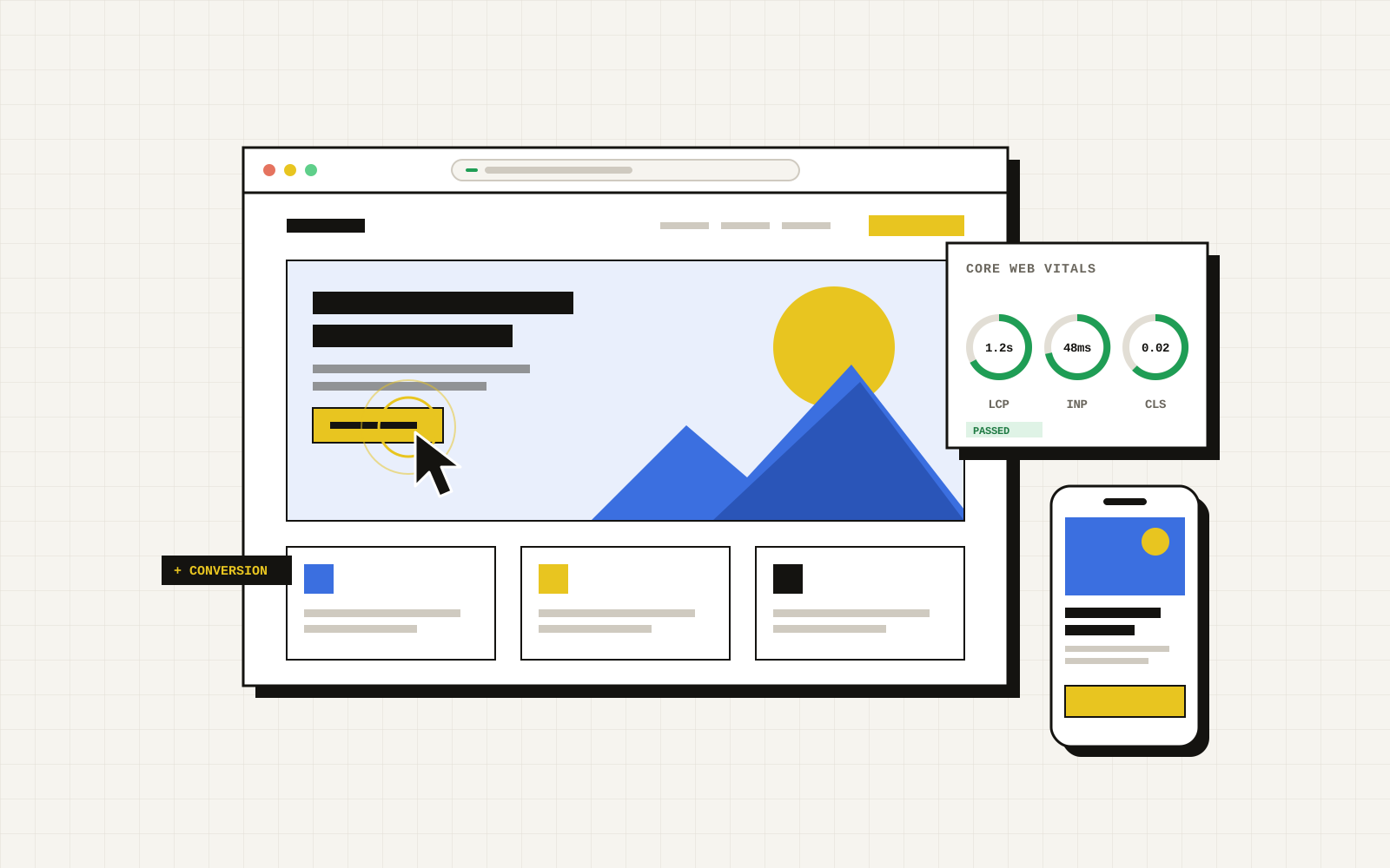
The top of your homepage, the part people see before they scroll, does one job: convince the right visitor to keep going. Premium brands often fail here, not because the design is poor, but because the message is beautiful and vague. A striking photo and the word "Elevate" do not tell a busy buyer whether you can solve their problem.
What a visitor needs in five seconds
- What you do, in plain words.
- Who it is for, so the right people recognise themselves.
- Where, if you serve a specific area.
- Why you, in one line of proof.
- What to do next, as one obvious button.
A useful formula for the headline and line beneath it: [What you do] for [who], [proof or differentiator]. For example: "Custom websites for Miami service businesses. Built to turn searches into booked calls."
The common mistakes
- Slogans instead of statements. "Where vision meets excellence" could be a bank, a gym or an architect.
- Sliders and carousels. Most visitors never see slide two. Pick your strongest message and commit to it.
- Too many buttons. "Learn more", "Our story", "Shop now" and "Contact" side by side means nobody knows which matters.
- Proof buried at the bottom. Reviews and recognisable names are most persuasive near the top.
- Slow hero media. Autoplay video and huge images that take seconds to load lose impatient mobile visitors before they see anything.
- Designing only for desktop. Most local service traffic is mobile. Check what fits on a phone screen before scrolling.
Proof that works above the fold
- A star rating with the number of reviews and the platform name.
- Logos or names of recognisable clients, with permission.
- One concrete result, attributed: "Revenue up after our relaunch, Molina's Roofing".
- Awards or certifications that buyers in your industry actually recognise.
Run the test yourself
- Take a screenshot of the top of your homepage on a phone.
- Show it to five people outside your company for five seconds each.
- Ask: what does this company do, who is it for, and what would you click?
- If fewer than four out of five get all three right, rewrite the headline before you touch the design.
You can do the same with paid tools that recruit testers, but friends of friends who fit your customer profile are enough to spot a vague message.
How to run the test properly (a script you can copy)
- Pick five people who do not know your business. Friends of friends are fine; employees and family are not.
- Show the page for five seconds on a phone, then hide it. Use a plain screenshot of what appears without scrolling.
- Ask three questions: "What does this company do?", "Who is it for?" and "What would you do next?"
- Score the answers. If at least four of five describe the offer correctly and name a sensible next step, the top of the page works. If answers are vague, wildly different or "I'm not sure", rewrite the headline and supporting line before touching anything else.
- Repeat on mobile and desktop. They are different pages as far as attention is concerned.
Before and after: what changes
A weak top of page says: "Excellence in everything we do. Welcome to our company." A strong one says: "Emergency AC repair in Miami-Dade, a technician at your door in 60 minutes. Call now or book online." The second names the service, the place, the promise and the action. It also gives the visitor a reason to believe it, which is where proof comes in.
- Headline: the outcome for the customer, in plain words.
- Supporting line: who it is for and how it works, in one sentence.
- One main button with a specific label ("Get my free proposal"), not "Submit" or "Learn more".
- One proof point: a real rating, a named client result or a recognisable credential, close to the button.
What to measure after you change it
Compare the same traffic source before and after: bounce or engagement rate on the landing page, clicks on the main button, and form completions. Give a change at least a couple of weeks and enough visits to see a pattern, and change one thing at a time. If the page converts but the leads are slow to be contacted, the next fix is not the page, it is your response time.
A clear top of page also helps search: pages that state plainly what they are tend to be easier for people and for crawlers to understand, as we cover in the technical SEO checklist. Our web design team builds pages around this test from the first sketch.
Beyond the fold
Once the top earns the scroll, the rest of the page should answer the questions buyers ask before they enquire: what is included, how the process works, typical timelines and price ranges, real examples, and FAQs. Then repeat the main action at the end. Clarity first, polish second.
Frequently asked questions
What is the five-second test?
It is a quick usability check where you show someone a page for five seconds and then ask what they remember, what the company does and what they would do next. It reveals whether your message and hierarchy are clear to a new visitor.
What should be above the fold on a business website?
A specific headline that states the outcome, one supporting line, one clear primary button, a single proof point such as a rating or client result, and navigation kept short. Anything that competes with these, such as auto-playing carousels or several equal buttons, usually dilutes the message.
Is above the fold still relevant on mobile?
Yes, though the fold is the bottom of the visible screen, which differs by device. Test on a real phone and make sure the offer and the main button are visible without scrolling.
How many people do I need for a five-second test?
Five people from your target audience will reveal most obvious clarity problems. If their answers disagree widely, the message is unclear even without a larger sample.